
2005 2GBC Awards: Best Interior Art
To give you an idea of how difficult this was for me to decide, 48 hours ago my gold medalist was out of the running. I narrowed the field to five titles, but could make a case for each to be the best and could make a case for why each should be left on the outside looking in.
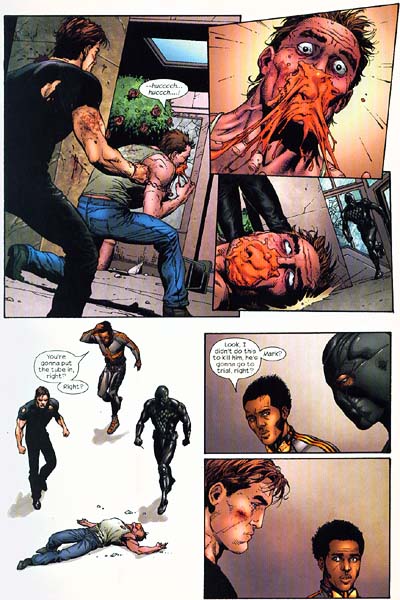 BRONZE MEDAL: SUPREME POWER
Gary Frank has been one of my favorite artists since he drew Hulk back in the early 90's. His clean lines are the closest thing you're going to find to Brian Bolland and Frank doesn't limit himself to just covers. My biggest complaint with Frank throughout his career is that he never draws anything I care about. Over the years, I've read books like Kin and Midnight Nation and Supergirl--hell, I own three pages of original art from Midnight Nation--just to get my Frank fix and Supreme Power is the latest in the line of titles "I don't hate but probably wouldn't read if Frank wasn't drawing them."
Why can't somebody figure out that Frank is one of the greatest talents in comics, has been for more than a decade, and deserves a full year on some title of consequence? Why did we just get a tease of his take on the Avengers? Why not pair him with Peter David on Friendly Neighborhood Spider-Man? Can't he have more than a third of an Elseworlds to try drawing Batman?
The only reason this title isn't my gold medalist is because it features no characters I'm dying to see rendered. I love Frank's designs of the various heroes and the art is always breathtaking, but I'd much rather have see him drawing JLA than a JLA knockoff. When I read this book (like the others mentioned above), I feel the way I would if Albert Pujols were playing for a Double-A team in Kalamazoo, hitting .650 and averaging a home run and 7 RBI per game, or if Robert DeNiro were doing dinner theater in... well, Kalamazoo. It's exciting and a display of great skill, but ultimately forgetable because it's happening on too small a small stage.
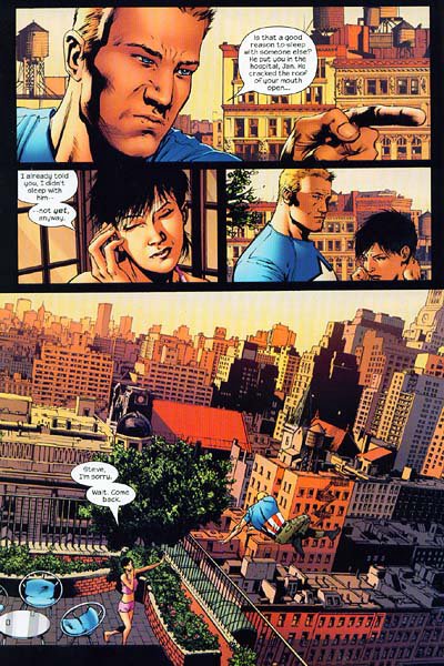
 SILVER MEDAL: ASTONISHING X-MEN
My complaint about Gary Frank is part of why John Cassaday gets the silver. Similar to the way Supreme Power's characters are reimagined Justice Leaguers, Planetary has given us several of Cassaday's re-takes on the Fantastic Four and Tarzan and Doc Savage and others, but--with the exception of the awesome Night on Earth one-shot that let us see Cassaday draw Batman of Bob Kane, the 70's, the TV show, Dark Knight Returns, and current continuity--we didn't see Cassaday drawing the iconic figures befitting a talent of his caliber.
Astonishing X-Men finally gave us a chance to regularly see one of comicdom's best pencillers take on Wolverine, Cyclops, and other mutant stars for 12 straight issues. 2004's issues, however, tended more toward the talky-talky, which is fine as long as Joss Wheadon is providing the script, but turned Cassaday into the proverbial Ferrari that never gets out of the neighborhood.
Was there ever really a proverb about a Ferrari that never got out of the neighborhood? I think it was in Leviticus...
Anyway, 2005's story arc of the Danger Room being sentient and trying to kill all the X-Men and Professor X gave Cassaday a chance to stretch his artistic muscles and he reacted like an animal getting out of a cage, making the most of every opportunity.
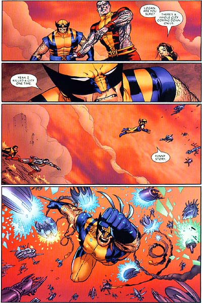
 GOLD MEDAL: THE ULTIMATES 2
I cannot think of a single page of Brian Hitch's art where he put forth as little as 95% effort. Every frame is a full 100% whether it's an invasion of tens of thousands of enemy troops swarming New York or Cap talking to Wasp in the park.
More than anything, I notice his backgrounds. Never does he try to get away with the jagged line of a horizon behind a talking head nor telling the colorist to just put a streak of a color behind two characters standing face to face. If that talking head is outside, you'll know whether the tree behind him is a birch or an elm by the leaves. If those two characters are in a hallway, you'll know if the doors there open inward or outward by the placement of the hinges.
Hitch also handles a cast--sometimes literally--of thousands without ever making Tony Stark look like Hank Pym or Wasp look like Black Widow, a challenge some artists can't answer even when they draw a one-character book (John Byrne, I am looking in your direction).
![]()
![]()
1 Comments:
Cassaday's art was about the only good thhing in that Porno Grip Ultron arc. What a terrible waste.
Post a Comment
<< Home