
2005 2GBC Awards: Best Cover
 BRONZE MEDAL: FABLES #38
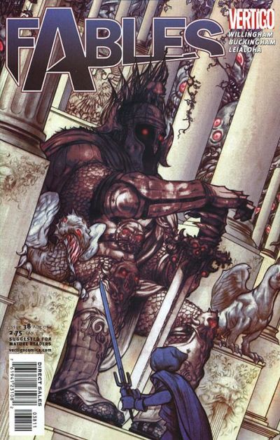 After 37 issues of hearing about the Adversary, the evil monster who'd methodically conquered land after land, enslaving and slaughtering whatever Fables could not escape to the mundy world, we finally see him.
 And James Jean makes sure he lives up to the hype.
On the other hand, Blue Boy doesn't seem too intimidated does he? Somehow, Jean manages to simultaneously make you say, "Oh, hell yeah! Go, Blue!" and, "Oh, hell no! Stop, Blue!" It also set up the story within perfectly, preparing us for the inevitable showdown without giving away too much.
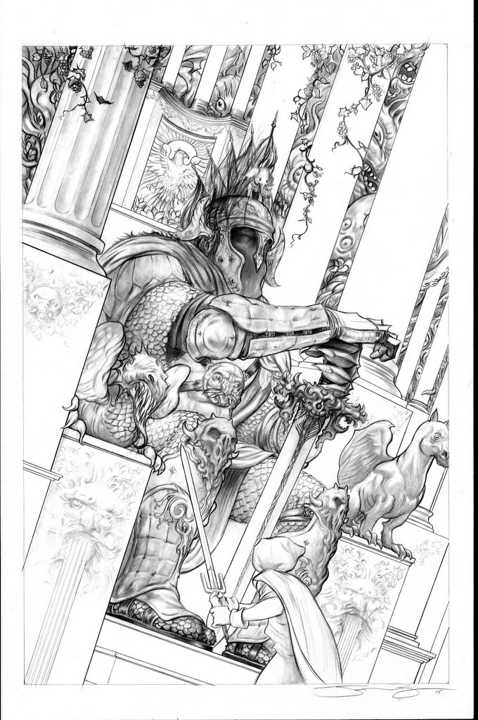
Interestingly, as nice as this is, the pencil layout is even nicer.
 SILVER MEDAL: THE ULTIMATES 2 #5
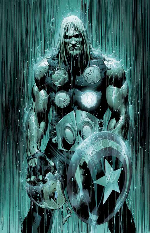 How much ass is this comic going to kick? Before you're even to page one, the answer is already "More than anything else I bought this month and everything I buy next month will have to try to live up to the standard set by this book."
Brian Hitch relies on the "Big Three" icons to bring about a very powerful image that makes it difficult to wait until you get home before you read it. Admit it, you tried to read it at stoplights, didn't you?
We have rain pouring down in buckets on Thor, so you know he's been using his power, but why? Well, apparently to kick the ever-living crap out of Iron Man and Captain America. Not that they went down easy, judging by Thor's appearance. This image is the cliche "If you think I look bad, you should see the other guys" on a superpowered scale.
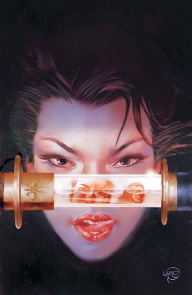
 GOLD MEDAL: Y: THE LAST MAN #35
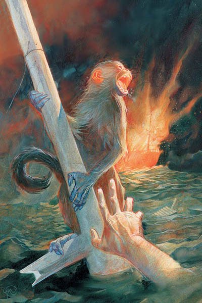 Massimo Carnevale's covers for this series are always beautiful and almost never are depicted from the obvious perspective. Not to mention that more often than not they feature monkeys, which everyone knows increases the value of a cover by 27%.
Yorick's oceanic journey to Australia has hit a bit of a snag. Or rather a few torpedoes from a submarine. Either way, the desperation of this cover grabs me by the chest. The water is littered with flotsam (and perhaps jetsam as well) and at about chin level. The burning boat is providing the only light in the starless night. Yorick is reaching out, but is it to grasp hopefully for the wreckage or to make contact with the monkey (who, granted, is not Ampersand, but still represents his best friend and the reason he survived the plague)?
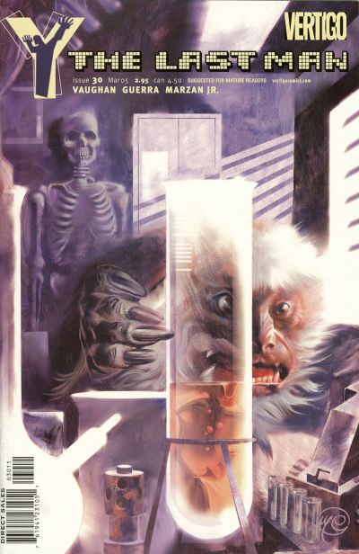
I wish I knew more about art so I could definitively say something about Carnevale's technique here and the rougher, sketchier style of this image versus some of the other three Y: The Last Man covers I was considering as candidates for this award (30, 31, and 40). #31 is probably the favorite among fans and is a more polished piece, but I preferred the action of this to the simplicity of that one. Since I'm commenting on the others, #30 grabbed my eye for the magnification of Ampersand's eye through the test tube and #40 is just a silly, fun cover that makes me think what a shame it is Michelangelo didn't put more flying monkeys and gigantic spermatazoa on the ceiling of the Sistine Chapel.
I'd been doing seperate columns for the candidates, but this one came down to the wire. In fact, as I've been writing this I've shuffled these three covers about five times. That said, here's the one that didn't make the cut. Should any of the top three covers fail in its duties as a 2GBC medalist, however, this cover will assume those duties.
RUNNER UP: EX MACHINA #15
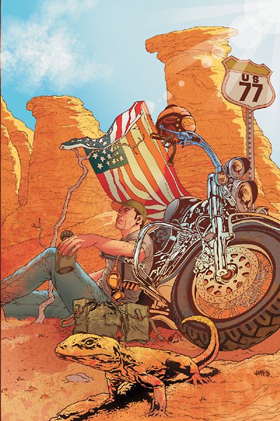 It's the gecko.
The motorcycle, the pose of reclining Mitch Hundred, the tread and spokes on that front wheel, the goggles hanging beneath his arm, the signpost (not the sign, but the post). The attention to detail is practically "contact a board-certified psychologist"-level obsessive-compulsive. Consider also how different this cover was from the rest of Harris's Ex Machina covers, which tended to be layers of images with a cold, machine-like feel to them and a lighting that appeared to come from a console, and this cover stood out even moreso.
The gecko, however, is what put this cover in the running for best of the year. He's just cute.
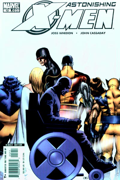
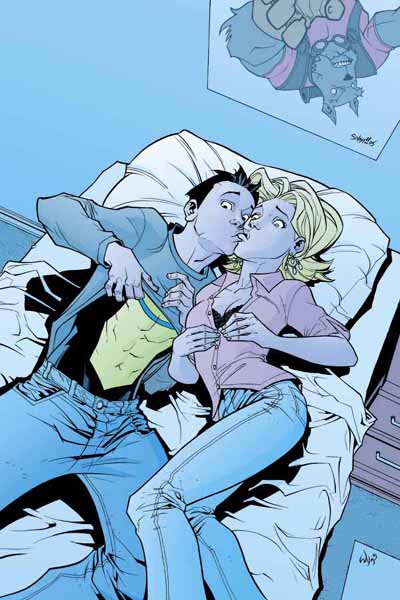
Others worthy of Honorable Mention: The poster-like feel of Fables #39 makes an otherwise depressing cover pretty cool. Punisher #25 still has some "Photoshop filter" feel to it, but was distinctly different from Bradstreet's typical "Punisher holding gun with _____ in the background" format. Astonishing X-Men #12 is simple, but powerful. Invincible #22 brought back memories of the complications of teenage romance and showed even superpowers don't make things any easier.
![]()
![]()
0 Comments:
Post a Comment
<< Home